Work About
GO BACK TO ALL PROJECTS

myWalgreens Loyalty Evolution

Leading end-to-end experience to transform the myWalgreens loyalty program to enhance convenience, increase profit per visit, and retain high-value members who were leaving due to program confusion and unclear value proposition.

Timeline
Aug 2024 - Aug 2025 (paused)
Platforms
Web & Mobile
Team
Cross-functional
Project Status
Designs completed & validated

Project Status

Design phase completed and validated. Implementation paused pending business alignment—a common pattern in large-scale loyalty transformations where executive stakeholders must align on strategy, budget, and timing across marketing, finance, technology, pharmacy operations, and legal.


The Problem


Walgreens was losing its most valuable members. The existing loyalty program fell short of meeting member needs, resulting in declining engagement and increasing churn among high-value customers.


Mobile view

What Research Revealed

Working with service designers, we conducted qualitative research with four key customer segments:

  • Complete Health & Convenience customers (retail + prescriptions)
  • Occasional Cross-Shoppers (low retail spend + prescriptions)
  • Engaged Rx Only (pharmacy-focused, no retail)
  • Frequent Retail Only (retail-focused, no pharmacy)

Insights That Shaped My Approach:

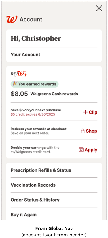
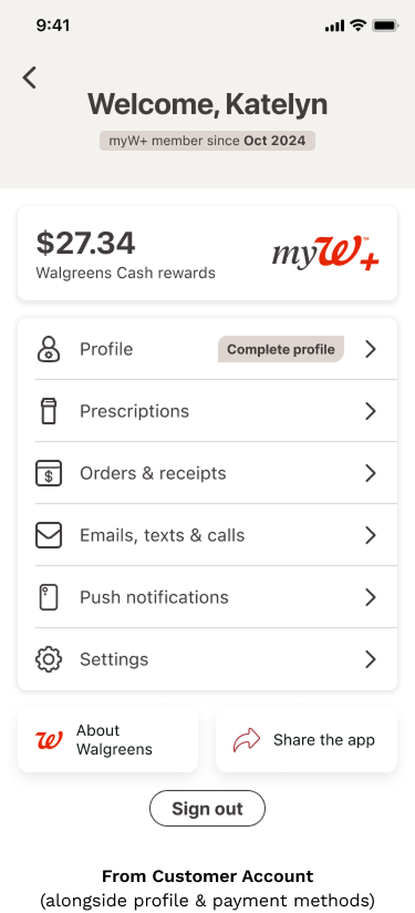
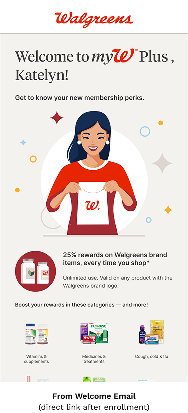
  1. Value perception is critical: Members are highly skeptical of paid subscription programs unless benefits clearly exceed costs
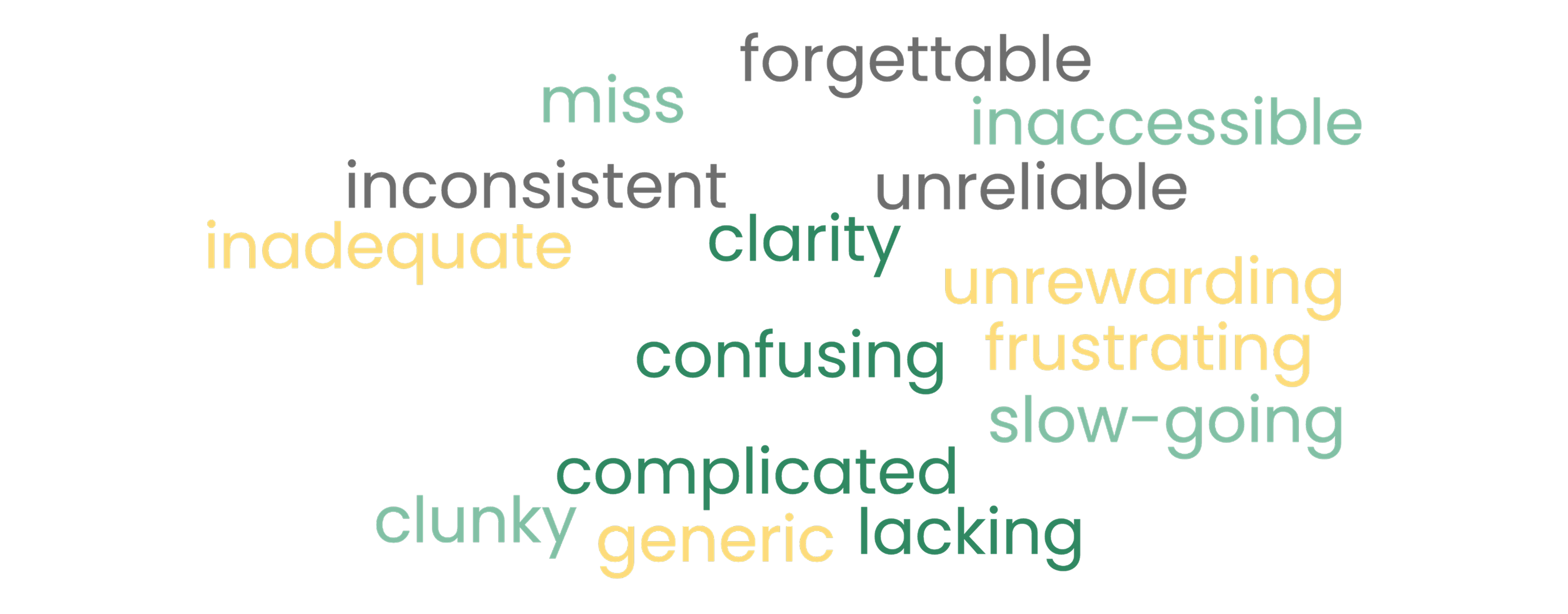
  2. The current program creates confusion: Members love rewards but find the experience "complicated" and "lacking clarity"
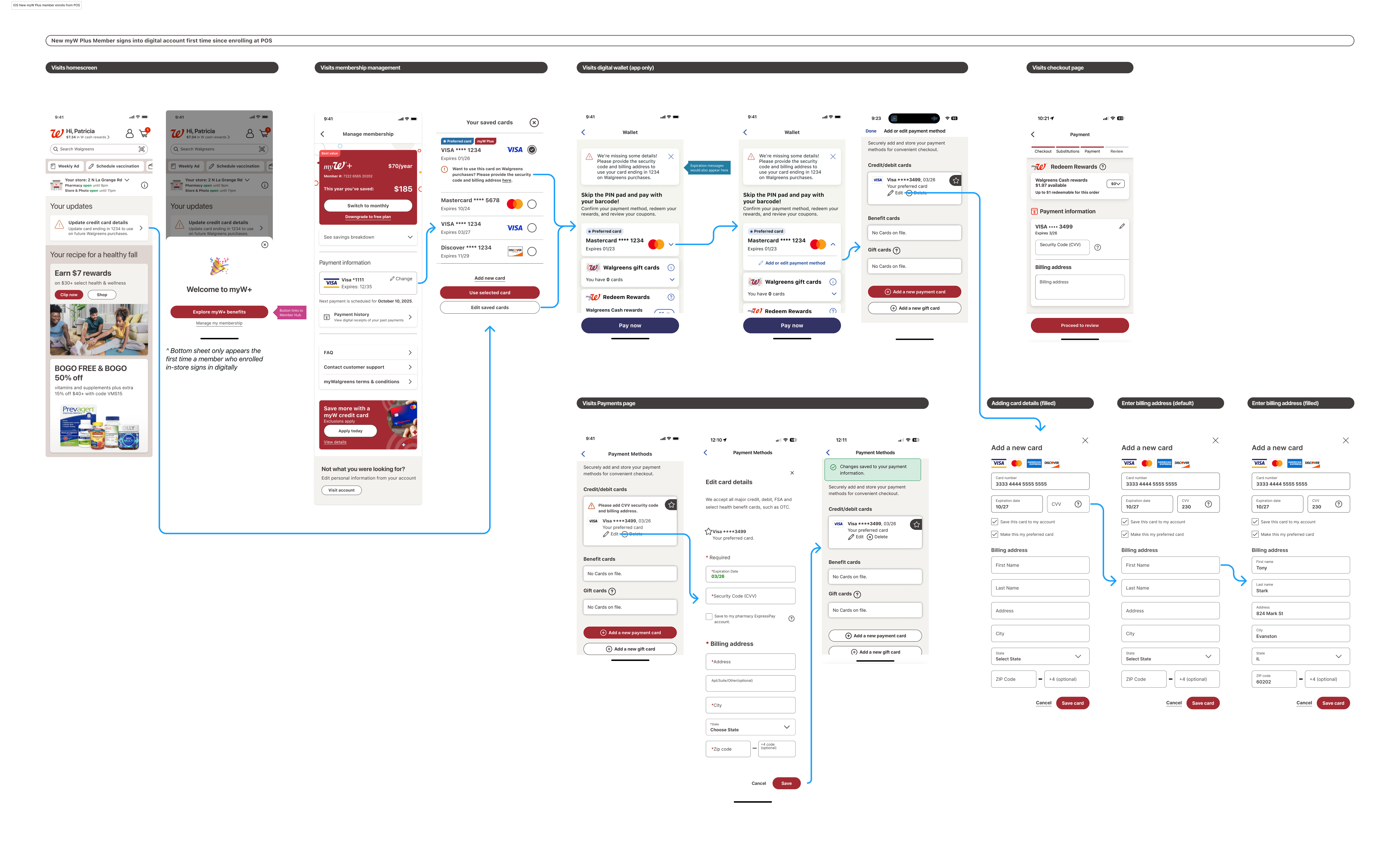
  3. Convenience drives visits: Sales and special deals bring members through the door, followed by convenient locations and rewards
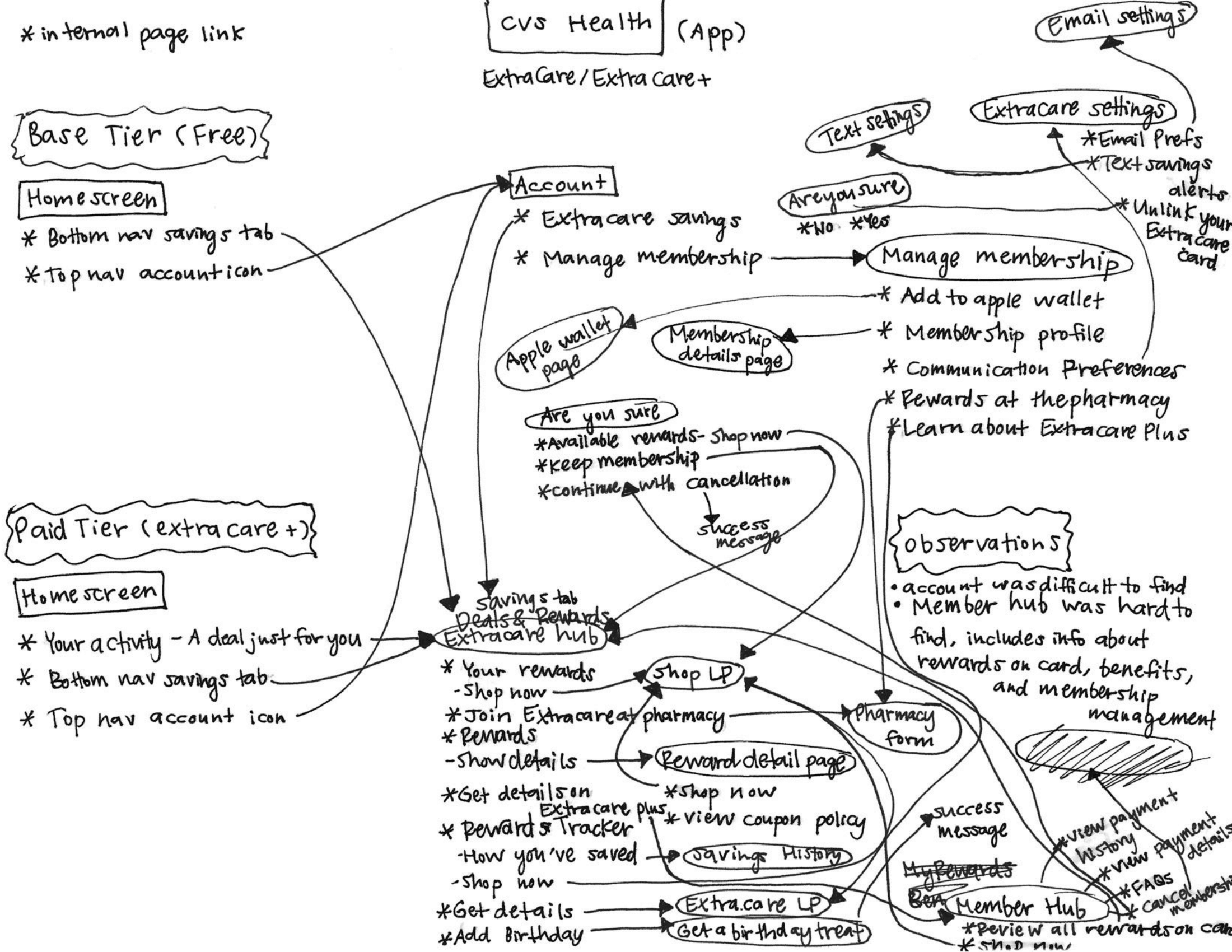
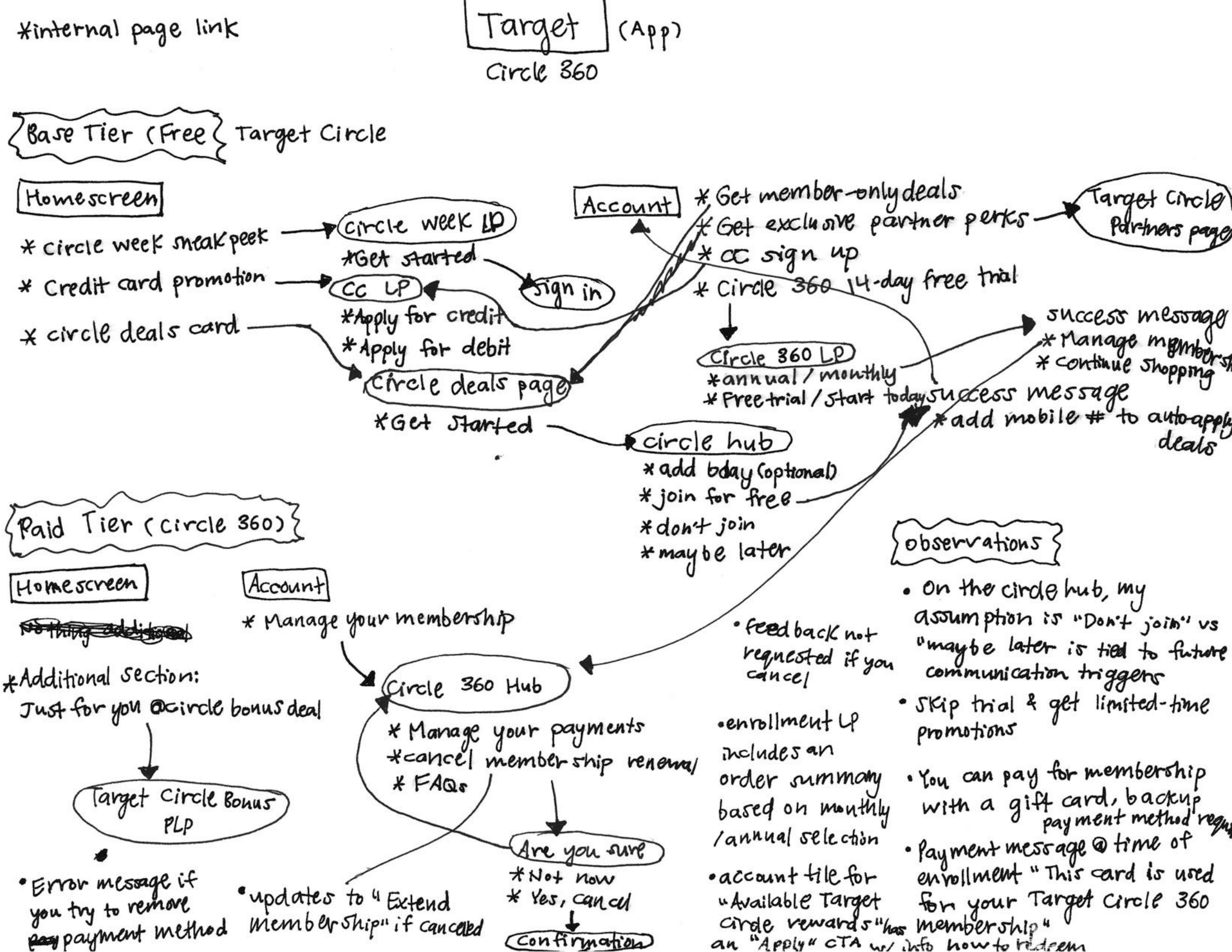
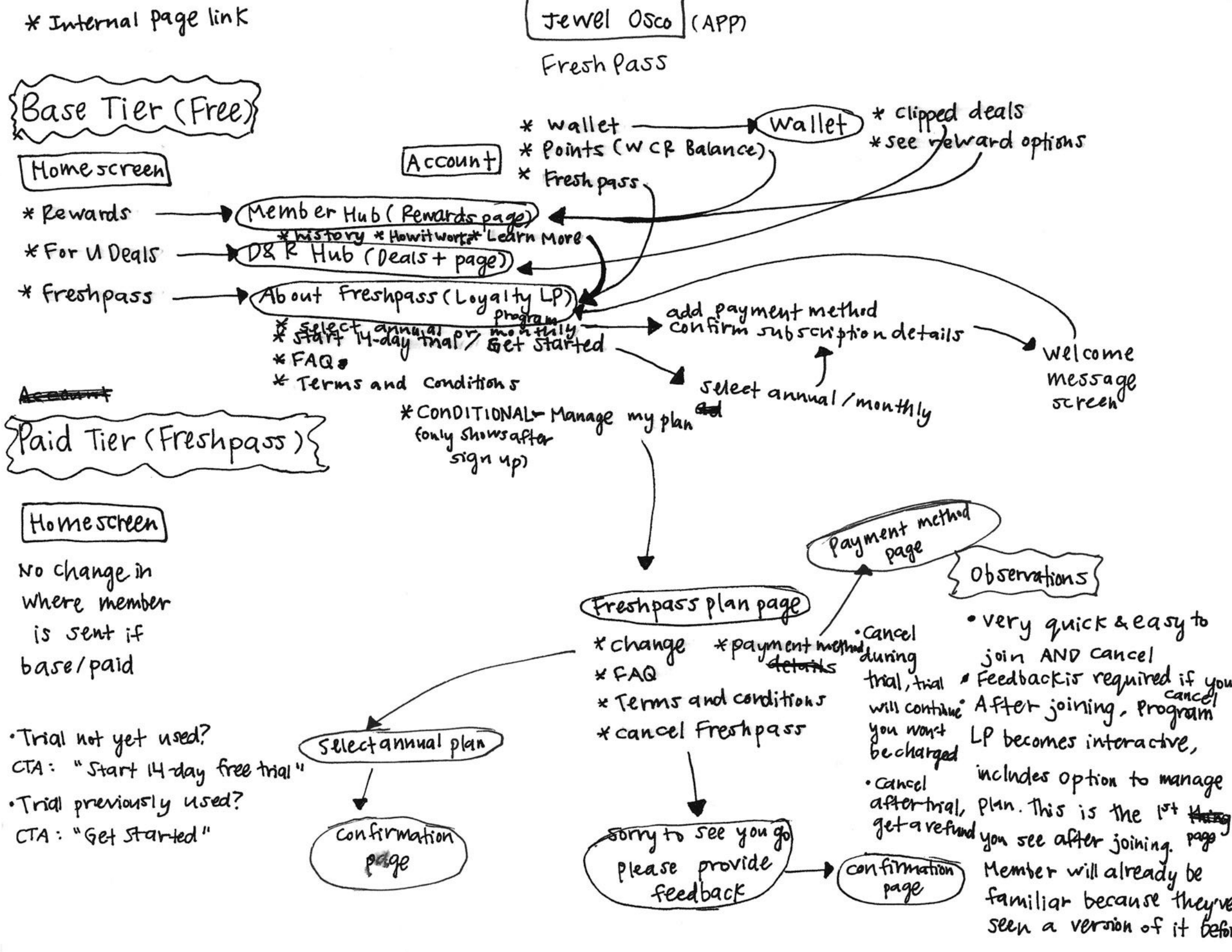
  4. Competitive benchmarking matters: Members compare to programs like CVS Health, Amazon Prime, Target Circle 360, and Walmart+


HOW MIGHT WE create a loyalty experience that clearly communicates value, simplifies program mechanics, and justifies a potential paid tier—while serving diverse member segments across retail, pharmacy, and health services?

The Strategic Approach

Competitive Analysis at Scale

To understand member expectations and industry standards, I conducted an extensive analysis of 20 subscription and membership programs across pharmacy/retail, food & beverage, and beauty industries.

Mobile view

For each program, I documented:

  • How they present membership value and benefits
  • Where they place entry points to membership management
  • How they handle payment method updates and renewals
  • What their tier comparison and upgrade experiences look like
  • How they communicate savings and ROI to members

Key Patterns That Shaped My Design:
  • 95% provided dedicated membership hubs accessible from account settings
  • 90% showed clear renewal dates and payment method visibility
  • 100% designed explicit cancellation processes with retention opportunities
  • 75% included savings visualization to demonstrate program value
  • Only 35% offered membership pause functionality (opportunity for differentiation)

Framework: Brilliant Basics vs Magic Moments

To align cross-functional stakeholders, I facilitated a collaborative workshop with marketing, loyalty design managers, and UX research/service designers. We needed a shared language for prioritizing features. I introduced the "Brilliant Basics vs Magic Moments" framework:

Brilliant Basics

Essential features that must work flawlessly (payment management, benefit visibility, renewal clarity)

Magic Moments

Opportunities to delight and engage beyond expectations (gamification, savings milestones, personalized recommendations)

This framework helped us evaluate every feature decision and build stakeholder consensus around what mattered most—especially critical when navigating future pivots and scope changes.

Design Principles

Based on research and competitive insights, I established core principles:

Transparent Value Communication: Make benefit value immediately visible and quantifiable
Simplicity in Complexity: Streamline program mechanics while maintaining robust features
Personalized Relevance: Highlight benefits based on member behavior and segment
Clear Differentiation: Visually distinguish between base and paid tier benefits
Actionable Next Steps: Ensure members always know how to use available benefits

What I Designed

Information Architecture Strategy

A critical early decision was determining where membership management should live within Walgreens' digital ecosystem. Based on Baymard Institute research on account management best practices, I designed multiple entry points:

Validation states Validation states Validation states Validation states


Competitive anlaysis validated that 95% of successful programs offer a multi-entry approach and ensured membership management would be discoverable from any logical starting point in the member journey.


Designing for Diverse Benefits Across Categories

One of the most complex challenges was designing how retail, pharmacy, and photo benefits could coexist throughout the experience. Each benefit type had different:

  1. Usage patterns (one-time vs recurring)
  2. Eligibility requirements (HIPAA consent for pharmacy rewards)
  3. Expiration timelines (monthly credits vs annual allowances)
  4. Application contexts (in-store, online, prescription counter)


I explored placement strategies for each benefit type:

  • Critical touchpoints: Where benefits must appear for discovery and utilization
  • Nice-to-have placements: Supplementary reminders that reinforce value
  • Potential opportunities: Areas needing more exploration for optimal integration

Validation states

The End-to-End Member Experience

To ensure the entire experience was cohesive—from first discovering the program through ongoing benefit utilization—I created a comprehensive prototype that demonstrated:

Discovery Phase:
  • How prospective members learn about program benefits
  • Tier comparison with clear value propositions
  • Entry points from various parts of the shopping journey
Enrollment Phase:
  • Simplified sign-up flows for both base and paid tiers
  • Payment method capture for paid memberships
  • Welcome experience setting expectations for benefit access
Utilization Phase:
  • Member hub showing personalized benefit tracking
  • Proactive reminders for unused benefits approaching expiration
  • Savings visualization demonstrating ROI
  • Easy access to membership management and payment updates

Validation states

Subscription Management System

Because members could enroll either at POS (in-store) or through digital channels, the subscription management system needed to:

  • Clearly indicate which payment method was linked to membership
  • Allow secure updates without disrupting active subscriptions
  • Provide payment history and renewal date visibility
  • Handle edge cases like expired cards, failed payments, and grace periods
  • Support two-factor authentication for members linking in-store enrollments to digital accounts

I designed comprehensive flows for all membership management scenarios, ensuring no user would hit a dead end:

  • Standard payment method updates
  • Changing membership tier (upgrade/downgrade)
  • Payment frequency modifications (monthly to annual)
  • Cancellation flows with retention opportunities
  • Card expiration warnings and update prompts
  • Failed payment recovery paths

Mobile view Validation states Mobile view Validation states


Multi-Platform Execution

I created platform-specific designs that maintained consistency while optimizing for each device:

  • Mobile App: Primary focus with detailed interaction design, bottom-sheet modals, and touch-optimized controls
  • Mobile Web: Adapted from app patterns with platform-appropriate navigation and responsive layouts
  • Desktop: Redesigned for larger screens with appropriate information density and side-by-side comparisonsy
  • Tablet: Specific layouts for both portrait and landscape orientations

Each platform maintained the same information hierarchy and interaction patterns while respecting device-specific conventions—ensuring members had a consistent experience regardless of how they accessed their membership.


Validation states

Navigating Complexity: The Pivot Story

The Reality of Large-Scale Loyalty Work

This initiative experienced multiple pauses and direction changes—not due to design quality, but because loyalty transformations require sustained alignment across numerous stakeholders (marketing, finance, technology, pharmacy operations, legal).
Each pivot taught me something valuable about designing in complex enterprise environments.


First Pivot: From Comprehensive to Pilot

After significant progress on the full program redesign, leadership announced a pilot launch within two months covering approximately 150 stores. This required rapid prioritization.

What I Did

I created platform-specific designs that maintained consistency while optimizing for each device:

  • ...
  • ...
  • ...
  • ...
  • ...

What I Learned

The ability to rapidly re-scope without compromising core user needs is essential. By having already established "brilliant basics vs magic moments," we had a framework for these tough prioritization decisions.

  • ...
  • ...
  • ...
  • ...
  • ...


Second Pivot: Simplified Benefits Focus

Work resumed with a narrowed scope: focusing on specific benefit types spanning retail, pharmacy, and photo services—similar to competitive offerings from CVS Health and Walmart+.
The outcome shifted from a full paid-tier launch to a nationwide rollout of enhanced benefits for existing paid members.

What Changed

I created platform-specific designs that maintained consistency while optimizing for each device:

  • ...
  • ...
  • ...
  • ...

What I Learned

Sometimes the most valuable design work isn't creating new features—it's ensuring existing features are discoverable and used. The shift to utilization highlighted the importance of proactive communication design.


Third Pause: Awaiting Strategic Alignments

As of August 2025, the project paused again while new business leadership evaluated contracts, budget, and go-to-market timing.

What I Learned

In enterprise environments, creating durable, well-documented design work is as important as creating beautiful interfaces. When implementation eventually proceeds, the work I completed will save months of future effort.

What I Learned

Designing for Organizational Readiness

The most valuable lesson from this project: in large enterprise environments, particularly with loyalty initiatives, design work often outpaces organizational readiness.

I learned to:

  • Create modular, well-documented designs that maintain value over time
  • Build stakeholder alignment alongside the design process through workshops and shared frameworks
  • Develop strategic tools (like "brilliant basics vs magic moments") that help organizations evaluate future development
  • Accept that external business factors drive timelines in ways designers can't control—and that's okay


The Importance of Foundational Thinking

Rather than viewing pauses as setbacks, I focused on creating work that would remain valuable regardless of when implementation occurred:

  • ...
  • ...
  • ...
  • ...

Cross-Functional Collaboration at Scale

Working with "many cooks in the kitchen" required constant communication and alignment:

  • ...
  • ...
  • ...
  • ...


The collaborative workshop approach proved especially valuable—it created shared ownership of the vision and made future pivots easier because stakeholders understood the strategic thinking behind decisions.

Adaptability as a Core Skill

Each pivot required quick thinking without compromising design quality:

  • Rapid re-scoping when timelines compressed
  • Maintaining design vision while accepting business constraints
  • Balancing ideal solutions with pragmatic delivery
  • Staying focused on user needs even as business priorities shifted


This project reinforced that flexibility and resilience are as important as design craft in complex enterprise environments.

Impact & Contributions


Designing for Organizational Readiness

Even without shipped product, this work created substantial value:


Research-Validated Approach: Comprehensive understanding of four distinct member segments and their loyalty needs

Competitive Intelligence: In-depth analysis of 20 programs identifying best practices and differentiation opportunities

Strategic Framework: "Brilliant basics vs magic moments" evaluation model used across design and product teams

Design System Contributions: Reusable patterns for benefit visualization, membership status, and payment management

Multi-Platform Designs: Complete design specifications for mobile, web, desktop, and tablet experiences

Comprehensive Documentation: User flows, edge cases, and implementation guidance ready for engineering


What This Work Enables

When business conditions align for launch, Walgreens has::

  • A validated design foundation reducing 3-6 months of future work
  • Clear understanding of member needs across diverse segments
  • Proven patterns extracted from competitive analysis
  • Platform-specific designs ready for development
  • Strategic frameworks for evaluating new features and additions


What This Project Proves

This work demonstrates my ability to:

Drive Strategy

  • Created frameworks that guided cross-functional decision-making
  • Conducted extensive competitive research to inform design direction
  • Facilitated workshops that built stakeholder consensus
  • Established design principles that survived multiple pivots
Execute with Quality

  • Delivered comprehensive, platform-specific designs
  • Mapped complex user flows accounting for all scenarios
  • Designed for multiple member segments with varying needs
  • Created work that maintained value through organizational change
Identify Problems

  • Used research to uncover root causes of member churn (confusion, unclear value)
  • Identified gaps in competitive offerings (membership pause, proactive reminders)
  • Recognized the need for multi-entry navigation based on user behavior patterns
Validate Assumptions

  • Tested concepts through competitive analysis of 20 programs
  • Collaborated with service designers on research synthesis
  • Built frameworks through collaborative workshops with stakeholders
  • Documented patterns that aligned with industry best practices
Navigate Ambiguity

  • Maintained design quality through three major pivots
  • Adapted scope without compromising core user needs
  • Created modular work that remained valuable despite timeline uncertainty
  • Balanced business constraints with user-centered design principles

Final Thoughts

Large-scale loyalty work is inherently complex—it requires alignment across more stakeholders, more systems, and more competing priorities than most product initiatives. The fact that this work hasn't shipped yet doesn't diminish its value; it demonstrates the reality of enterprise design where creating durable, strategic foundations is as important as shipping features quickly.

When Walgreens is ready to move forward, they have a validated roadmap built on solid research, competitive intelligence, and user-centered design thinking. That's the work I'm most proud of.

⚠️ Some content in this case study has been redacted or kept intentionally broad to comply with NDA and confidentiality agreements. All work shown is my own. Interested in the full story? Let's connect.